Roots for your responsive site

What the hell?

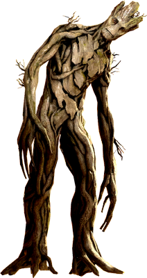
Did you know that Bootstrap features approximately zero Marvel movie references? That's just not acceptable in this day and age, is it? So I've clumsily shoehorned Vin Diesel's sensational work as a talking tree into a CSS stylesheet (and now, a jQuery plugin!) and made it into a thing you could theoretically actually use in production. For those of you who want to cover your markup in excessive, hard to read references to Guardians of the Galaxy, this is the grid framework for you. Grab it from Github if you want.

Rows

Make a row or new layout context by adding the class we-are-groot to your container. Faster than Drax' reflexes, and easier than an Aaskvarian.

Columns

Here's where it gets fun. The number of o's in the word groot dictates how many columns to span, starting from two o's.

That means that i-am-groot will span 1, i-am-grooot will span 2, and so on, right up to i-am-grooooooooooooot which will span all 12 columns.

Grid

1
2
3
4
5
6
7
8
9
10
11
12
1
2
1
2
3
1
2
3
4
1
2

No Gutter

To go gutterless, just take out the hyphens between the words "I am Groot" - Like so: iamgroot

1
2
3
4
5
6
7
8
9
10
11
12
1
2
1
2
3
1
2
3
4
1
2

Responsive

Grootstrap is mobile first and comes with two baked in breakpoints - Use titlecase to indicate a tablet column width, and uppercase to indicate a desktop column width.

<div class="i-am-grooooooooooooot I-Am-Grooooooot I-AM-GROOOOT">l</div>

In this example, the div will span 12 columns on mobile, 6 on tablet and 4 on desktop. Resize the page to see it in action below

1
2
3
4

You can also use the gutterless grid in this way.

<div class="iamgrooooooooooooot IAmGrooooooot IAMGROOOOT">l</div>

1
2
3
4

jQuery Plugin

NEW FOR VOL. 2 - You can now add even more Groot-based goodness to your website with our jQuery plugin. Add grootstrap.min.js or grootstrap.js to your project and then use:

$('.selector').grootstrap();

on an <input> of your choice. You can try it for yourself on the form fields below.

First name:
Last name:

FAQs

The responsive stuff doesn't work for me!

There's probably an issue with your doctype declaration and you're ending up in quirks mode or something. See this Stack Overflow answer for more information on case sensitivity in class names.

I was looking for a serious grid system and ended up here by mistake!

Well, I made this using Susy, which is excellent. So... Go try that.

What is wrong with you?

I've got issues.